Chapter 3 Why do we visualize data?
Before we start looking at how we can visualize our data, let’s first answer why data visualization is important. Visualization can be helpful (or even essential) to represent results of statistical analyses, to formulate hypotheses and summarize theory, to explore your data so that you understand it better via exploratory analysis or outlier detection, and more. Most importantly, visualization is most useful to communicate and report your findings to others when it is done:
- Clearly (using good design principles);
- Precisely and accurately (a plot is worth 1000 words);
- Effectively and efficiently.
Here is an example of an ineffective visualization:
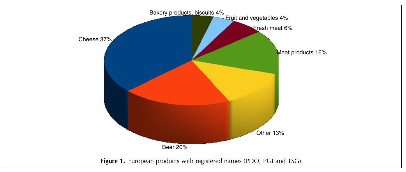
Figure 3.1: An example of an ineffective visualization.
What is wrong with this image? Try to answer for yourself what you think this figure is trying to communicate and whether it is successful. How could this image be improved?
Hints: Why is this in 3D? Which elements do your eyes focus on first? How does a pie chart visually communicate the information?
To ensure you are communicating effectively, here are some important questions to ask yourself when visualizing your data:
- What do you want to communicate?
- Who is your audience?
- What is the best way to visualize your message?
A good rule of thumb: think simple! use less ink!