class: center, middle, inverse, title-slide # Workshop 3: Introduction to <code>ggplot2</code> ## QCBS R Workshop Series ### Québec Centre for Biodiversity Science --- class: inverse, center, middle # About this workshop [](https://github.com/QCBSRworkshops/workshop03) [](https://wiki.qcbs.ca/r_workshop3) [](https://qcbsrworkshops.github.io/workshop03/workshop03-en/workshop03-en.html) [](https://qcbsrworkshops.github.io/workshop03/workshop03-en/workshop03-en.pdf) [](https://qcbsrworkshops.github.io/workshop03/workshop03-en/workshop03-en.R) --- # Required packages * [grid](https://cran.r-project.org/package=grid) * [gridExtra](https://cran.r-project.org/package=gridExtra) * [ggplot2](https://cran.r-project.org/package=ggplot2) * [ggsignif](https://cran.r-project.org/package=ggsignif) * [ggdendro](https://cran.r-project.org/package=ggdendro) * [maps](https://cran.r-project.org/package=maps) * [mapproj](https://cran.r-project.org/package=mapproj) * [RColorBrewer](https://cran.r-project.org/package=RColorBrewer) * [GGally](https://cran.r-project.org/package=GGally) * [patchwork](https://cran.r-project.org/package=patchwork) * [plotly](https://cran.r-project.org/package=plotly) <br> ```R install.packages(c('grid', 'gridExtra', 'ggplot2', 'ggsignif', 'ggdendro', 'maps', 'mapproj', 'RColorBrewer', 'GGally', 'patchwork', 'plotly')) ``` --- # Leaning objectives ##### 1. Use R to create various plots --- class: inverse, center, middle # Introduction --- # Introduction ##### To follow along: Code and .HTML available at http://qcbs.ca/wiki/r/workshop3 ##### Recommendations: 1. create your own new script; 2. refer to provided code only if needed; 3. avoid copy-pasting or running the code directly from the script. ###### [ggplot2](https://ggplot2.tidyverse.org/) is also on GitHub: https://github.com/tidyverse/ggplot2 --- # Outline ###### 1. `ggplot2` mechanics .center[ 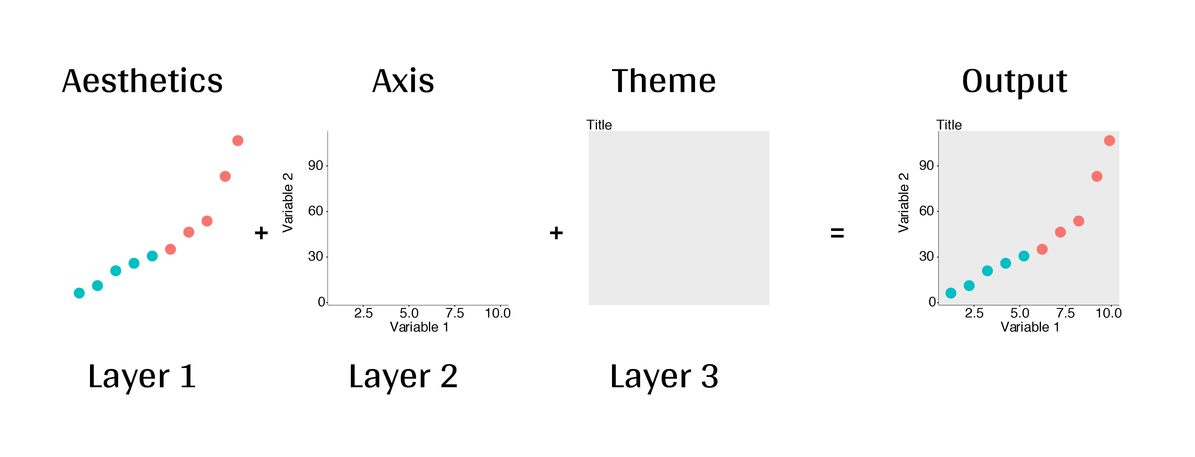 ] ###### 2. Advanced visualization ###### 3. Fine-tuning ###### 4. Saving plots ###### 5. Conclusion --- # Learning objectives <br> - Teach the basics of data visualization using R. - Find packages and resources to meet your needs. - Inspire creativity in science! - Develop understanding of design for effective graphical communication. --- class: inverse, center, middle # Visualization in science --- # Visualization in science <br> #### Why are we using data visualization? #### What makes an effective visualization? <br> .center[] What do you think about this one ? --- # Visualization in science <br> 1. To represent results of statistical analyses 2. To formulate hypotheses and understand summarize theory 3. To explore your own data (exploratory analysis, outlier detection) 4. To communicate and report - Clearly (using good design principles) - Precisely and accurately (a plot is worth 1000 words) - Effectively and efficiently ??? note: _changed points here as answers from previous slide question_ --- # Visualization in science <br> Important questions: - What do you want to communicate? - Who is your audience? - What is the best way to do it? .center[ .alert[A rule of thumb: think simple — use less ink!] ] -- #### Additional resources - [Fundamentals of Data Visualization](https://serialmentor.com/dataviz/) (ggplot) - [A Compendium of Clean Graphs in R](https://www.shinyapps.org/apps/RGraphCompendium/index.php#line-plots) (base plot) - [Graphics Principles](https://graphicsprinciples.github.io/) (design tips) --- # WARNING! <br> .alert[ `R` is not made for drawings. ] Other drawing softwares are probably better options such as [GIMP](https://www.gimp.org/) or [Inkscape](https://inkscape.org/). It is important to get the right tool for the right task! --- # Why use R for plotting? .center[] --- # Why use R for plotting? Reproducibility .center[] .alert[Reproducible science comes with effort]: - comment your script - add information in the figures (titles, labels, captions, annotations) --- # Why R for graphs? #### .alert[ Because of its powerful features!] In this workshop, we focus only on `ggplot2`, but [multiple packages and functions](https://insileco.github.io/wiki/rgraphpkgs/) can be used for great visualization (e.g., [`base R`](https://bookdown.org/rdpeng/exdata/the-base-plotting-system-1.html), [`plotly`](https://plot.ly/r/), [`sjPlot`](http://www.strengejacke.de/sjPlot/), [`mapview`](https://r-spatial.github.io/mapview/), [`igraph`](https://igraph.org/r/)). <img src="workshop03-en_files/figure-html/unnamed-chunk-1-1.png" width="648" style="display: block; margin: auto;" /> --- # `ggplot2` is versatile 1. [`ggplot2`](https://ggplot2.tidyverse.org/) package lets you make *beautiful* and customizable plots; 2. it implements the grammar of graphics, an reliable system for building plots. 3. it [has many extensions](https://exts.ggplot2.tidyverse.org/gallery/). .center[] --- class: inverse, center, middle # `ggplot2` mechanics: the basics --- # Grammar of Graphics (GG) basics ```r install.packages("ggplot2") # if not already installed library(ggplot2) ``` A graphic is made of different layers: .center[  ] Using the GG system, we can build graphs step by step for customizable results. --- # Grammar of Graphics (GG) basics GG layers have specific names that you will see throughout the presentation: 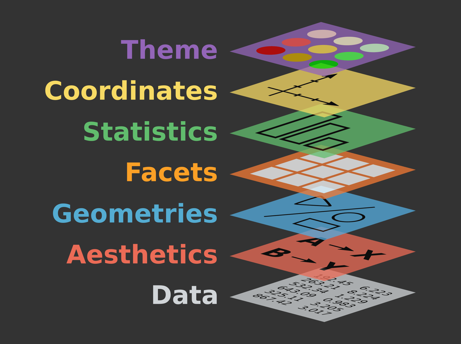 .small[image adapted from [The Grammar of Graphics](https://www.springer.com/gp/book/9780387245447)] ??? note: _changed image to more intuitive layers_ --- exclude: true # Grammar of Graphics (GG) basics .center[  ] ??? note: _removed this slide becase it felt random_ --- # Grammar of Graphics (GG) basics Here are the basic requirements to draw the simplest `ggplot`: .center[  ] --- # Grammar of Graphics (GG) GG layers: - Data - your data, in tidy format, will provide ingredients for your plot - use `dplyr` techniques to prep data for optimal plotting format - usually, one row for every observation that you want to plot ??? note: _included subpoints for data since other bullets had subpoints_ --- # Grammar of Graphics (GG) GG layers: - Data - Aesthetics (aes), to make data visible - `x`, `y`: variable along the x and y axis - `colour`: color of geoms according to data - `fill`: the inside color of the geom - `group`: what group a geom belongs to - `shape`: the figure used to plot a point - `linetype`: the type of line used (solid, dashed, etc) - `size`: size scaling for an extra dimension - `alpha`: the transparency of the geom --- # Grammar of Graphics (GG) GG layers: - Data - Aesthetics (aes), to make data visible - `x`, `y`: variable along the x and y axis - `colour`: color of geoms according to data - `fill`: the inside color of the geom - `group`: what group a geom belongs to - `shape`: the figure used to plot a point - `linetype`: the type of line used (solid, dashed, etc) - `size`: size scaling for an extra dimension - `alpha`: the transparency of the geom .alert[note: aesthetics are based on quantities in your data, but plots may have some of these qualities not based in data as well. (ie, colouring based on a data group is an aesthetic, but points will always have a colour even if not based on data.)] --- # Grammar of Graphics (GG) GG layers: - Data - Aesthetics (aes) - Geometric objects (geoms) * `geom_point()`: scatterplot * `geom_line()`: lines connecting points by increasing value of x * `geom_path()`: lines connecting points in sequence of appearance * `geom_boxplot()`: box and whiskers plot for categorical variables * `geom_bar()`: bar charts for categorical x axis * `geom_histogram()`: histogram for continuous x axis * `geom_violin()`: distribution kernel of data dispersion * `geom_smooth()`: function line based on data --- # Grammar of Graphics (GG) GG layers: - Data - Aesthetics (aes) - Geometric objects (geoms) - Facets * `facet_wrap()` or `facet_grid()` for small multiples ??? note: _descriptions of scales to talk about more layers_ --- # Grammar of Graphics (GG) GG layers: - Data - Aesthetics (aes) - Geometric objects (geoms) - Facets - Statistics * similar to geoms, but computed * show means, counts, and other statistical summaries of data ??? note: _descriptions of themes to talk about more layers_ --- # Grammar of Graphics (GG) GG layers: - Data - Aesthetics (aes) - Geometric objects (geoms) - Facets - Statistics - Coordinates - fitting data onto a page * `coord_cartesian` to set limits * `coord_polar` for circular plots * `coord_map` for different map projections ??? note: _descriptions of other layerss_ --- # Grammar of Graphics (GG) GG layers: - Data - Aesthetics (aes) - Geometric objects (geoms) - Facets - Statistics - Coordinates - Themes * overall visual defaults * fonts, colors, shapes, outlines ??? note: _descriptions of other layerss_ --- # How layer in ggplot works 1. Create a simple plot object: * `plot.object <- ggplot()` 2. Add geometric layers: * `plot.object <- plot.object + geom_*()` 3. Add appearance layers: * `plot.object <- plot.object + coord_*() + theme()` 3. Repeat step 2-3 until satisfied, then print: * `plot.object` or `print(plot.object)` ??? note: _changed to +geom because it implied that layer() was a function to be used_ --- # Prepare data for `ggplot2` `ggplot2` requires you to prepare the data as an object of class `data.frame` or `tibble` (common in the `tidyverse`). ```r library(tibble) class(iris) # all set! # [1] "data.frame" ir <- as_tibble(iris) # acceptable class(ir) # [1] "tbl_df" "tbl" "data.frame" ``` **♻ Recall from the [*Loading and manipulating data*](http://qcbs.ca/wiki/r_workshop2) workshop**: More complex plots in `ggplot` require the long data frame format --- # iris dataset ```r ## ?iris str(iris) # 'data.frame': 150 obs. of 5 variables: # $ Sepal.Length: num 5.1 4.9 4.7 4.6 5 5.4 4.6 5 4.4 4.9 ... # $ Sepal.Width : num 3.5 3 3.2 3.1 3.6 3.9 3.4 3.4 2.9 3.1 ... # $ Petal.Length: num 1.4 1.4 1.3 1.5 1.4 1.7 1.4 1.5 1.4 1.5 ... # $ Petal.Width : num 0.2 0.2 0.2 0.2 0.2 0.4 0.3 0.2 0.2 0.1 ... # $ Species : Factor w/ 3 levels "setosa","versicolor",..: 1 1 1 1 1 1 1 1 1 1 ... ``` .center[**Scientific questions**] - Is there a relation between the **length** & the **width** of the iris **Sepal** ? - Does the size of the **Petal & Sepal** vary together ? - How are these measures distributed among the **3 Iris species** ? .center[.alert[How can we graphically address these questions with `ggplot`?]] --- # Exploring data structure <!-- Explain the databases before the examples --> ```r install.packages("GGally") library(GGally) ggpairs(iris,aes(colour=Species)) + theme_bw() ``` <img src="workshop03-en_files/figure-html/unnamed-chunk-6-1.png" width="738" style="display: block; margin: auto;" /> ??? note: _ggpairs (ggplot version of psych package) allows us to explore correlations in data_ --- # Exploring data structure <img src="workshop03-en_files/figure-html/unnamed-chunk-7-1.png" width="648" style="display: block; margin: auto;" /> .small[♻ See [*Loading and manipulating data workshop*](http://qcbs.ca/wiki/r_workshop2) to learn how to clean your dataset.] --- exclude: true # Inheritance in `ggplot2` .small[ .pull-left[ **Inheritance from ggplot** ```r p <- ggplot(data = iris, aes(x = Sepal.Length, y = Sepal.Width)) p <- p + geom_point() p ``` <img src="workshop03-en_files/figure-html/unnamed-chunk-8-1.png" width="432" style="display: block; margin: auto;" /> ] .pull-right[ **No inheritance from ggplot** ```r s <- ggplot() s <- s + geom_point(data = iris, aes(x = Sepal.Length, y = Sepal.Width)) s # Print your final plot ``` <img src="workshop03-en_files/figure-html/unnamed-chunk-9-1.png" width="432" style="display: block; margin: auto;" /> ] ] ??? note: _removed this slide because it felt random, but is maybe worth going over at some point - edit. moved to challenge 1 answer_ --- # Grammar of Graphics: *recall* Remember: a graphic is made of different layers:  --- # `ggplot()` dynamics: data layer ```r ggplot(data = iris) ``` <img src="workshop03-en_files/figure-html/unnamed-chunk-10-1.png" width="360" style="display: block; margin: auto;" /> --- # `ggplot()` dynamics: aesthetics layer ```r ggplot(data = iris, aes(x = Sepal.Length, y = Sepal.Width)) ``` <img src="workshop03-en_files/figure-html/unnamed-chunk-11-1.png" width="360" style="display: block; margin: auto;" /> --- # `ggplot()` dynamics: geometric Layer ```r ggplot(data = iris, aes(x = Sepal.Length, y = Sepal.Width)) + geom_point() ``` <img src="workshop03-en_files/figure-html/unnamed-chunk-12-1.png" width="360" style="display: block; margin: auto;" /> --- # `ggplot()` dynamics: extras- facet, stats, coord layers ```r ggplot(data = iris, aes(x = Sepal.Length, y = Sepal.Width)) + geom_point() + facet_wrap(~Species) + coord_trans(x = "log10", y = "log10") ``` <img src="workshop03-en_files/figure-html/unnamed-chunk-13-1.png" width="432" style="display: block; margin: auto;" /> --- # Challenge #1 (5min) ![:cube]() #### Draw your 1st ggplot! .alert[Question] > Is there a relation between the **length** & the **width** of the iris **petal** ? > Does the *width* of the petal increase with its *length* ? .center[Parameters to consider when addressing this question:] data | geom | x value | y value :-------------:|:-------------:|:-------------:|:-------------: iris|geom_point|Petal length|Petal width --- # Challenge 1#: Solution ![:cube]() ```r ggplot(data = iris, aes(x = Petal.Length, y = Petal.Width)) + geom_point() ``` <img src="workshop03-en_files/figure-html/unnamed-chunk-14-1.png" width="432" style="display: block; margin: auto;" /> --- # Challenge 1#: Solution ![:cube]() .pull-left[ ```r ggplot(data = iris, aes(x = Petal.Length, y = Petal.Width)) + geom_point() ``` <img src="workshop03-en_files/figure-html/unnamed-chunk-15-1.png" width="432" style="display: block; margin: auto;" /> ] .pull-right[ **note**: aesthetics can either be in the `ggplot()` line, and will be inherited by every geom, or in the `geom_*()` line to apply to that geom only! ] --- # Challenge 1#: Solution ![:cube]() .pull-left[ ```r ggplot(data = iris, aes(x = Petal.Length, y = Petal.Width)) + geom_point(shape = 2, color="blue") ``` <img src="workshop03-en_files/figure-html/unnamed-chunk-16-1.png" width="432" style="display: block; margin: auto;" /> ] .pull-right[ **note**: aesthetics can either be in the `ggplot()` line, and will be inherited by every geom, or in the `geom_*()` line to apply to that geom only! <br> <br> **note 2**: colour, alpha, shape, and size commands can be set outside of `aes()` values, and will be static, not data-dependent. ] --- class: inverse, center, middle # Aesthetic mapping ## colour, shape, size, labels and transparency --- # Aesthetic **Use aesthetics (`aes()`) to distinguish classes, groups and structure** <img src="workshop03-en_files/figure-html/unnamed-chunk-17-1.png" width="576" style="display: block; margin: auto;" /> --- # Colouring: make your points talk Change **colour** to  differentiate between groups  represent data values  highlight specific elements .pull-left[ <img src="workshop03-en_files/figure-html/unnamed-chunk-18-1.png" width="360" style="display: block; margin: auto;" /> ] .pull-right[ <img src="workshop03-en_files/figure-html/unnamed-chunk-19-1.png" width="360" style="display: block; margin: auto;" /> ] .center[ .footnote[See [Fundamentals of Data Visualization](https://serialmentor.com/dataviz/colour-basics.html)] ] ??? note: _hard to get caption in the right place with these css commands... Used footnote here for best results, but there is probably a better way_ --- # Using `aes()` use to change colour Do the sepal length and width vary differently across species? .pull-left[ ```r # No colour mapping ggplot(data = iris,aes(x = Sepal.Length, y = Sepal.Width)) + geom_point() + geom_smooth(method=lm)+ labs(title = "No colour mapping") ``` <img src="workshop03-en_files/figure-html/unnamed-chunk-20-1.png" width="432" /> ] .pull-right[ ```r # With colour mapping ggplot(data = iris, aes(x = Sepal.Length, y = Sepal.Width, colour = Species)) + geom_point() + geom_smooth(method=lm) + labs(title = "With colour mapping") ``` <img src="workshop03-en_files/figure-html/unnamed-chunk-21-1.png" width="432" /> ] --- # Change colour manually .pull-left[ ```r # Default pp <- ggplot(data = iris) + geom_point(mapping = aes(x = Sepal.Length, y = Sepal.Width, colour = Species)) pp + labs(title = "Default") ``` <img src="workshop03-en_files/figure-html/unnamed-chunk-22-1.png" width="432" /> ] .pull-right[ ```r # Manual pp + scale_colour_manual(values = c("grey55", "orange", "skyblue")) + labs(title = "Manual") ``` <img src="workshop03-en_files/figure-html/unnamed-chunk-23-1.png" width="432" /> ] ??? note: _changed to left/right because cut off_ --- # Colour gradients .pull-left[ ```r # Default pp2 <- ggplot(data = iris) + geom_point(mapping = aes(x = Sepal.Length, y = Sepal.Width, colour = Petal.Length)) pp2 + labs(title = "Default") ``` <img src="workshop03-en_files/figure-html/unnamed-chunk-24-1.png" width="432" /> ] .pull-right[ ```r # Manual pp2 + scale_colour_gradient(low = "blue", high = "red") + labs(title = "Manual") ``` <img src="workshop03-en_files/figure-html/unnamed-chunk-25-1.png" width="432" /> ] ??? note: _changed to left/right because cut off_ --- # Use a predefined colour palette ```r install.packages("RColorBrewer") require(RColorBrewer) display.brewer.all() ```  --- # Use a predefined colour palette ```r # Palette for groups pp + scale_colour_brewer(palette = "Dark2") + labs(title = "Palette for groups") ``` <img src="workshop03-en_files/figure-html/unnamed-chunk-27-1.png" width="432" /> --- # Use a predefined colour palette ```r # Palette for continuous values pp2 + scale_color_viridis_c()+ labs(title = "Palette for continuous values") ``` <img src="workshop03-en_files/figure-html/unnamed-chunk-28-1.png" width="432" /> --- # Use a predefined colour palette Grey-scale palette for publication purposes ```r # Palette for groups pp + scale_colour_grey() + labs(title = "Palette for groups") ``` <img src="workshop03-en_files/figure-html/unnamed-chunk-29-1.png" width="432" /> --- # Use a predefined colour palette ```r # Palette for continuous values pp2 + scale_colour_gradient(low = "grey85", high = "black") + labs(title = "Palette for continuous values") ``` <img src="workshop03-en_files/figure-html/unnamed-chunk-30-1.png" width="432" /> --- # Use colourblind-friendly palettes How your figure might appear under various forms of colourblindness? We can use [colorblindr](https://github.com/clauswilke/colorblindr) that is not currently on CRAN, so we install it with the packages [remotes](https://cran.r-project.org/web/packages/remotes/index.html). ```r remotes::install_github("clauswilke/colorblindr", quiet = TRUE) library(colorblindr) ``` --- # Use colourblind-friendly palettes ```r cvd_grid(pp) ``` <img src="workshop03-en_files/figure-html/unnamed-chunk-31-1.png" width="792" style="display: block; margin: auto;" /> --- # Use colourblind-friendly palettes .pull-left[ ```r # Palette for groups pp + scale_colour_viridis_d() + labs(title = "viridis palette for groups") ``` <img src="workshop03-en_files/figure-html/unnamed-chunk-32-1.png" width="432" style="display: block; margin: auto;" /> ] .pull-right[ ```r # Palette for continuous values pp2 + scale_colour_viridis_c() + labs(title = "viridis palette for continuous values") ``` <img src="workshop03-en_files/figure-html/unnamed-chunk-33-1.png" width="432" style="display: block; margin: auto;" /> ] --- # Changing `shape`, `size` and `alpha` .pull-left[ ```r # shape for groups ggplot(data = iris) + geom_point(aes(x = Sepal.Length, y = Sepal.Width, shape = Species)) + labs(title = "shape for groups") ``` <img src="workshop03-en_files/figure-html/unnamed-chunk-34-1.png" width="432" style="display: block; margin: auto;" /> ] .pull-right[ ```r # size and alpha for continuous values ggplot(data = iris) + geom_point(aes(x = Sepal.Length, y = Sepal.Width, size = Petal.Length, alpha = Petal.Length)) + labs(title = "size and alpha for continuous values") ``` <img src="workshop03-en_files/figure-html/unnamed-chunk-35-1.png" width="432" style="display: block; margin: auto;" /> ] --- # Challenge #2 ![:cube]() - Produce an informative plot from built-in datasets such as `mtcars`, `CO2` or `msleep`. - Use appropriate aesthetic mappings for different data types <br> Data| x | y | Aesthetics :-------------:|:-------------:|:-------------:|:-------------: mtcars |*wt* |*mpg* | *disp* and *hp* CO2 |*conc* |*uptake* | *Treatment* and *Type* msleep |log10(*bodywt*) |*awake* | *vore* and *conservation* ToothGrowth | *dose* | *len* | *supp* <br> .center[.alert[  Pay attention to the data types! ] ] --- # Challenge #2 ![:cube]() #### .alert[Breakout rooms! - 15 min] <br> make a plot to share with the group ??? note: _assign each group a dataset to make a plot from: mtcars, CO2, msleep, and ToothGrowth to make exploratory plots_ --- # Challenge #2 - Solution example #1 .small[ Data| x | y | Aesthetics :-------------:|:-------------:|:-------------:|:-------------: mtcars |*wt* |*mpg* | *disp* and *hp* ] ```r data(mtcars) ggplot(data = mtcars) + geom_point(mapping = aes(x = wt, y = mpg, colour = disp, alpha = hp)) ``` <img src="workshop03-en_files/figure-html/unnamed-chunk-36-1.png" width="432" style="display: block; margin: auto;" /> .comment[Could you use `size` instead of `alpha`? What about `shape`?] --- # Challenge #2 - Solution example #2 .small[ Data| x | y | Aesthetics :-------------:|:-------------:|:-------------:|:-------------: CO2 |*conc* |*uptake* | *Treatment* and *Type* ] ```r data(CO2) ggplot(data = CO2) + geom_point(mapping = aes(x = conc, y = uptake, colour = Treatment, shape = Type)) ``` <img src="workshop03-en_files/figure-html/unnamed-chunk-37-1.png" width="432" style="display: block; margin: auto;" /> .comment[Why not use `size = Type`?] --- # Challenge #2 - Solution example #3 .small[ Data| x | y | Aesthetics :-------------:|:-------------:|:-------------:|:-------------: msleep |log10(*bodywt*) |*awake* | *vore* and *conservation* ] ```r data(msleep) ggplot(data = msleep) + geom_point(mapping = aes(x = log10(bodywt), y = awake, colour = vore, shape = conservation)) ``` <img src="workshop03-en_files/figure-html/unnamed-chunk-38-1.png" width="432" style="display: block; margin: auto;" /> --- # Challenge #2 - Solution example #4 .small[ Data| x | y | Aesthetics :-------------:|:-------------:|:-------------:|:-------------: ToothGrowth | *dose* | *len* | *supp* ] ```r data(ToothGrowth) ggplot(ToothGrowth, aes(x=dose,y=len,color=supp)) + geom_point() + geom_smooth(method = lm, formula='y~x') ``` <img src="workshop03-en_files/figure-html/unnamed-chunk-39-1.png" width="432" style="display: block; margin: auto;" /> --- class: small-code # Changing the scale of the axes .tiny[ .pull-left[ x axis in regular scale ```r ggplot(diamonds) + geom_point(mapping = aes(x = carat, y = price)) + labs(title = "x-axis in regular scale") ``` <img src="workshop03-en_files/figure-html/unnamed-chunk-40-1.png" width="432" style="display: block; margin: auto;" /> ] ] .pull-right[ x-axis and y-axis in log10() scale ```r ggplot(diamonds) + geom_point(mapping = aes(x = carat, y = price)) + coord_trans(x = "log10", y = "log10") + labs(title = "x- and y-axes in log10 scale") ``` <img src="workshop03-en_files/figure-html/unnamed-chunk-41-1.png" width="432" style="display: block; margin: auto;" /> ] <br> .footnote[It is also possible to transform the coordinate system using <br> `scale_x_log10()` and `scale_y_log10()`] <!-- explain the difference --> ??? note: _changed to coord_trans because that's what we indroduced earlier as a layer_ --- class: inverse, center, middle # Fine-tuning your plots # Using `theme()` to make it look good! --- # `theme()` .pull-left[ **Theme Classic** ```r # Theme classic pp + scale_colour_grey() + theme_classic() + labs(title = "Classic") ``` <img src="workshop03-en_files/figure-html/unnamed-chunk-42-1.png" width="432" style="display: block; margin: auto;" /> ] .pull-right[ **Theme Minimal** ```r pp + scale_colour_grey() + theme_minimal() + labs(title = "Minimal") ``` <img src="workshop03-en_files/figure-html/unnamed-chunk-43-1.png" width="432" style="display: block; margin: auto;" /> ] .footnote[NB: Good choices for publication purposes!] --- # `theme()` Use `theme_set()` to change theme for all your future plots, or `theme_update()` to edit aspects of a theme setting. .pull-left[ **Set theme** ```r # Set Classic as default theme_set(theme_bw()) pp ``` <img src="workshop03-en_files/figure-html/unnamed-chunk-44-1.png" width="432" style="display: block; margin: auto;" /> ] .pull-right[ **Update theme** ```r # remove minor gridlines theme_update(panel.grid.minor = element_blank()) pp ``` <img src="workshop03-en_files/figure-html/unnamed-chunk-45-1.png" width="432" style="display: block; margin: auto;" /> ] --- exclude: true # ggThemeAssist: RStudio-addin  ??? note: _removed this slide to add theme image instead_ --- # `theme()` Elements of a theme 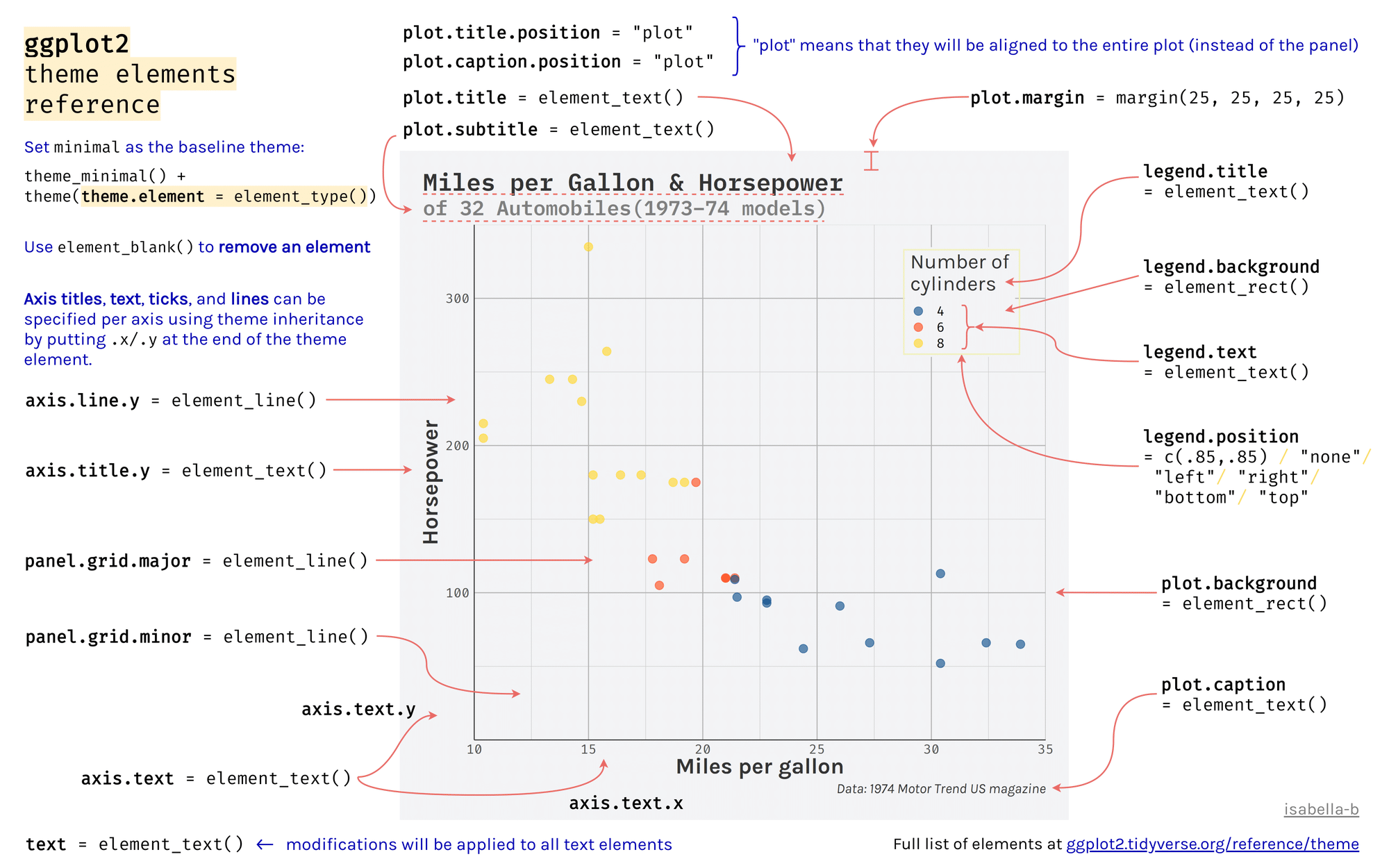 --- class: inverse, center, middle # Fine-tuning your plots # Using `facet_grid()` to change the arrangement of plots --- # iris dataset: per-species facets ```r ggplot(data = iris) + geom_point(mapping = aes(x = Sepal.Length, y = Sepal.Width, colour = Species)) + facet_grid(~ Species, scales = "free") ``` <img src="workshop03-en_files/figure-html/unnamed-chunk-47-1.png" width="720" style="display: block; margin: auto;" /> --- # CO2 dataset: per-type facets ```r ggplot(data = CO2) + geom_point(mapping = aes(x = conc, y = uptake, colour = Treatment)) + xlab("CO2 Concentration (mL/L)") + ylab("CO2 Uptake (umol/m^2 sec)") + facet_grid(~ Type) ``` <img src="workshop03-en_files/figure-html/unnamed-chunk-48-1.png" width="720" style="display: block; margin: auto;" /> <!-- relabeling ticks --> --- # Title and axes components: changing size, colour and face .center[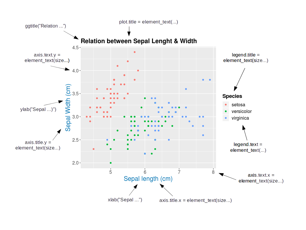] --- # Title and axes components: size, colour and face .pull-left[ **Default** <img src="workshop03-en_files/figure-html/unnamed-chunk-49-1.png" width="432" style="display: block; margin: auto;" /> ] .pull-right[ **Axes and title tuning** <img src="workshop03-en_files/figure-html/unnamed-chunk-50-1.png" width="432" style="display: block; margin: auto;" /> ] --- # Challenge #3 ![:cube]() Use the `tips` dataset found in `reshape2` 📦 to reproduce the plot below. Our tip: start from `theme_classic()` and add `theme()` to make your additional changes. <img src="workshop03-en_files/figure-html/unnamed-chunk-51-1.png" width="720" style="display: block; margin: auto;" /> --- # Challenge #3 ![:cube]() #### .alert[Breakout rooms! - 15 min] ??? note: _give teams time to work together to recreate this plot. Refer to theme elements slide_ --- # Challenge #3: Solution![:cube]() ```r library(reshape2) tips.gg <- ggplot(tips, aes(x = total_bill, y = tip/total_bill, shape = smoker, colour = sex, size = size)) + geom_point() + facet_grid( ~ time) + scale_colour_grey() + labs(title = "Relation between total bill and tips during lunch and dinner", x = "Total bill ($)", y = "Ratio between tips and total bill") + theme_classic() + theme(axis.title = element_text(size = 16, colour = "navy"), axis.text = element_text(size = 12), plot.title = element_text(size = 16, colour = "orange3", face = "bold"), strip.text.x = element_text(size = 14, face="bold")) tips.gg ``` --- # Challenge #3: step-by-step solution #### `aes()` ```r theme_set(theme_classic()) tips.gg <- ggplot(tips) + geom_point(mapping = aes(x = total_bill, y = tip/total_bill, shape = smoker, colour = sex, size = size)) tips.gg ``` <img src="workshop03-en_files/figure-html/unnamed-chunk-53-1.png" width="504" style="display: block; margin: auto;" /> --- # Challenge #3: step-by-step solution #### `facet_grid()` ```r tips.gg <- tips.gg + facet_grid( ~ time) tips.gg ``` <img src="workshop03-en_files/figure-html/unnamed-chunk-55-1.png" width="504" style="display: block; margin: auto;" /> --- # Challenge #3: step-by-step solution #### Grey-scale palette ```r tips.gg <- tips.gg + scale_colour_grey() tips.gg ``` <img src="workshop03-en_files/figure-html/unnamed-chunk-56-1.png" width="504" style="display: block; margin: auto;" /> --- # Challenge #3: step-by-step solution #### Adding plot title and labels ```r tips.gg <- tips.gg + labs(title = "Relation between total bill and tips during lunch and dinner", x = "Total bill ($)", y = "Ratio between tips and total bill") tips.gg ``` <img src="workshop03-en_files/figure-html/unnamed-chunk-57-1.png" width="504" style="display: block; margin: auto;" /> --- # Challenge #3: step-by-step solution #### Adding a theme and fine tuning it .small[ ```r tips.gg <- tips.gg + theme_classic() + theme(axis.title = element_text(size = 16, colour = "navy"), axis.text = element_text(size = 12), plot.title = element_text(size = 16, colour = "orange3", face = "bold"), strip.text.x = element_text(size = 14, face = "bold")) tips.gg ``` <img src="workshop03-en_files/figure-html/unnamed-chunk-58-1.png" width="432" style="display: block; margin: auto;" /> ] --- class: inverse, center, middle # Fine-tuning your plots # Using `geom_*()` to create different plots --- # `ggplot2::geom_*()` .center[  ] --- exclude: true # `base::plot()` .center[  ] ??? note: removed this slide. Not sure why it's here. --- # `ggplot2::ggplot()` ```r ggplot(iris, aes(Sepal.Length)) ``` <img src="workshop03-en_files/figure-html/unnamed-chunk-59-1.png" width="432" style="display: block; margin: auto;" /> --- # Histograms: `geom_histogram()` A **histogram** is an accurate graphical representation of the distribution of numeric data - only one aesthetic required ```r ggplot(iris, aes(Sepal.Length)) + geom_histogram() + ggtitle("Histogram of sepal length ") ``` <img src="workshop03-en_files/figure-html/unnamed-chunk-60-1.png" width="432" style="display: block; margin: auto;" /> --- # Scatterplot and linear-fit: `geom_point()` and `geom_smooth()` .small[ .pull-left[ ```r ggplot(mpg, aes(displ, hwy)) + geom_point() + labs(title = "Scatterplot") ``` <img src="workshop03-en_files/figure-html/unnamed-chunk-61-1.png" width="432" style="display: block; margin: auto;" /> ] .pull-right[ ```r ggplot(mpg, aes(displ, hwy)) + geom_point() + labs(title = "Linear Regression") + geom_smooth(method = lm) ``` <img src="workshop03-en_files/figure-html/unnamed-chunk-62-1.png" width="432" style="display: block; margin: auto;" /> ] ] --- # Boxplot: `geom_boxplot()` ```r ggplot(data = iris, aes(Species, Sepal.Length, fill = Species)) + geom_boxplot() + labs(title = "Boxplot") ``` <img src="workshop03-en_files/figure-html/unnamed-chunk-63-1.png" width="432" style="display: block; margin: auto;" /> --- # Boxplot: `geom_boxplot()` <img src="workshop03-en_files/figure-html/unnamed-chunk-64-1.png" width="504" style="display: block; margin: auto;" /> .center[  ] --- #### Boxplot with annotations: `geom_boxplot()` and `geom_signif()` ```r library(ggsignif) ggplot(data = iris, aes(Species, Sepal.Length)) + geom_boxplot() + geom_signif(comparisons = list(c("versicolor", "virginica")), map_signif_level=TRUE) ``` <img src="workshop03-en_files/figure-html/unnamed-chunk-65-1.png" width="432" style="display: block; margin: auto;" /> --- # Violin plot: `geom_violin()` As explained on https://www.data-to-viz.com/graph/violin.html > Violin plot allows to visualize the distribution of a numeric variable for one or several groups. [...] It is really close to a boxplot, but allows a deeper understanding of the distribution. .pull-left[ <img src="workshop03-en_files/figure-html/unnamed-chunk-66-1.png" width="432" style="display: block; margin: auto;" /> ] .pull-right[ <img src="workshop03-en_files/figure-html/unnamed-chunk-67-1.png" width="432" style="display: block; margin: auto;" /> ] --- # Violin plot: `geom_violin()` ```r violin <- ggplot(data = iris, aes(x=Species, y=Sepal.Length)) + geom_violin(trim=F,fill="grey70",alpha=.5) + labs(title = "Violin plot") violin ``` <img src="workshop03-en_files/figure-html/unnamed-chunk-68-1.png" width="432" style="display: block; margin: auto;" /> --- # Violin plot: `geom_violin()` + `_boxplot()` + `_jitter()` ```r violin + geom_jitter(shape=16, position=position_jitter(0.2), alpha=.3)+ geom_boxplot(width=.05) ``` <img src="workshop03-en_files/figure-html/unnamed-chunk-69-1.png" width="432" style="display: block; margin: auto;" /> ??? note: _added this plot to show how multiple geoms can be used together_ --- # Summarise y values: `stat_summary()` .pull-left[ ```r ggplot(mtcars, aes(cyl, mpg)) + geom_point() + stat_summary(fun.y = "median", geom = "point", colour = "red",size=5) + labs(title = "Means") ``` <img src="workshop03-en_files/figure-html/unnamed-chunk-70-1.png" width="288" style="display: block; margin: auto;" /> ] .pull-right[ ```r ggplot(mtcars, aes(cyl, mpg)) + geom_point() + stat_summary(fun.data = "mean_cl_boot", colour = "red",size=2) + labs(title = "Means and confidence intervals") ``` <img src="workshop03-en_files/figure-html/unnamed-chunk-71-1.png" width="288" style="display: block; margin: auto;" /> ] --- # Summarise values See also `geom_errorbar()`, `geom_pointrange()`, `geom_linerange()`, `geom_crossbar()` for geoms to display summarised data. --- # Representing maps: `geom_map()` .small[ ```r crimes <- data.frame(state = tolower(rownames(USArrests)), USArrests) crimesm <- reshape2::melt(crimes, id = 1) library(maps) states_map <- map_data("state") ggplot(crimes, aes(map_id = state)) + geom_map(aes(fill = Murder), map = states_map) + expand_limits(x = states_map$long, y = states_map$lat) + coord_map() ``` <img src="workshop03-en_files/figure-html/unnamed-chunk-72-1.png" width="432" style="display: block; margin: auto;" /> ] --- ## Density plots: `geom_density()` .small[A density plot shows the distribution of a numerical variable and it takes only set of numeric values as input.] .pull-left[ ```r iris.dens <- ggplot(iris, aes(Sepal.Length)) + geom_density() iris.dens ``` <img src="workshop03-en_files/figure-html/unnamed-chunk-73-1.png" width="360" style="display: block; margin: auto;" /> ] .pull-right[ ```r cars.dens <- ggplot(cars, aes(dist)) + geom_density() cars.dens ``` <img src="workshop03-en_files/figure-html/unnamed-chunk-74-1.png" width="360" style="display: block; margin: auto;" /> ] --- # Dendogram: `ggdendrogram()` ```r library(ggdendro) USArrests.short = USArrests[1:10,] hc <- hclust(dist(USArrests.short), "ave") ggdendrogram(hc, rotate = TRUE, theme_dendro = FALSE) ``` <img src="workshop03-en_files/figure-html/unnamed-chunk-75-1.png" width="432" style="display: block; margin: auto;" /> --- # Arrange plots: `patchwork` **Add multiple graphs on the same plot** ```r install.packages("patchwork") library(patchwork) iris.dens + cars.dens + plot_annotation(tag_levels = 'a') ``` <img src="workshop03-en_files/figure-html/unnamed-chunk-76-1.png" width="648" style="display: block; margin: auto;" /> --- # Final Challenge![:cube]() Create your own graph and follow these recommendations: * Dataset: any (recommended: use your dataset) * Explore a new geom_* and other plot elements Use the following links for tips: https://ggplot2.tidyverse.org/reference/index.html http://shinyapps.stat.ubc.ca/r-graph-catalog/ --- # Final Challenge: Solution example #1 .small[ ```r data(msleep) msleep.challenge4 <- ggplot(msleep, aes(vore, log10(brainwt), fill=vore)) msleep.challenge4 + geom_violin() + geom_signif(comparisons = list(c("herbi", "insecti"))) + labs(main = "Brain weight among different vore", y = "log10(Brain weight (Kg))") + scale_fill_grey() + theme_classic() ``` <img src="workshop03-en_files/figure-html/unnamed-chunk-77-1.png" width="432" style="display: block; margin: auto;" /> ] --- # Final Challenge: Solution example #2 .small[ ```r data(mtcars) mtcars.short <- mtcars[1:20,] mtcars.short.hc <- hclust(dist(mtcars.short), "complete") dendro.challenge4 <- ggdendrogram(mtcars.short.hc, rotate = TRUE, theme_dendro = FALSE) dendro.challenge4 + ggtitle("Car dendro from motor spec") + xlab("Cars") + theme(axis.title.y = element_text(size = 16), axis.title.x = element_blank(), axis.text.x = element_blank(), axis.text.y = element_text(size = 12), plot.title = element_text(size = 14, face="bold")) ``` <img src="workshop03-en_files/figure-html/unnamed-chunk-78-1.png" width="360" style="display: block; margin: auto;" /> ] --- ## Miscellaneous: interactive plots using `plotly()` .small[ .alert[**Select the species data to display directly from the legend**] ```r p = ggplot(iris, aes(x=Sepal.Length, y=Sepal.Width, colour=Species, shape=Species)) + geom_point(size=6, alpha=0.6) plotly::ggplotly(p) ``` <div id="htmlwidget-163b424a91cd1971a92c" style="width:720px;height:360px;" class="plotly html-widget"></div> <script type="application/json" data-for="htmlwidget-163b424a91cd1971a92c">{"x":{"data":[{"x":[5.1,4.9,4.7,4.6,5,5.4,4.6,5,4.4,4.9,5.4,4.8,4.8,4.3,5.8,5.7,5.4,5.1,5.7,5.1,5.4,5.1,4.6,5.1,4.8,5,5,5.2,5.2,4.7,4.8,5.4,5.2,5.5,4.9,5,5.5,4.9,4.4,5.1,5,4.5,4.4,5,5.1,4.8,5.1,4.6,5.3,5],"y":[3.5,3,3.2,3.1,3.6,3.9,3.4,3.4,2.9,3.1,3.7,3.4,3,3,4,4.4,3.9,3.5,3.8,3.8,3.4,3.7,3.6,3.3,3.4,3,3.4,3.5,3.4,3.2,3.1,3.4,4.1,4.2,3.1,3.2,3.5,3.6,3,3.4,3.5,2.3,3.2,3.5,3.8,3,3.8,3.2,3.7,3.3],"text":["Sepal.Length: 5.1<br />Sepal.Width: 3.5<br />Species: setosa<br />Species: setosa","Sepal.Length: 4.9<br />Sepal.Width: 3.0<br />Species: setosa<br />Species: setosa","Sepal.Length: 4.7<br />Sepal.Width: 3.2<br />Species: setosa<br />Species: setosa","Sepal.Length: 4.6<br />Sepal.Width: 3.1<br />Species: setosa<br />Species: setosa","Sepal.Length: 5.0<br />Sepal.Width: 3.6<br />Species: setosa<br />Species: setosa","Sepal.Length: 5.4<br />Sepal.Width: 3.9<br />Species: setosa<br />Species: setosa","Sepal.Length: 4.6<br />Sepal.Width: 3.4<br />Species: setosa<br />Species: setosa","Sepal.Length: 5.0<br />Sepal.Width: 3.4<br />Species: setosa<br />Species: setosa","Sepal.Length: 4.4<br />Sepal.Width: 2.9<br />Species: setosa<br />Species: setosa","Sepal.Length: 4.9<br />Sepal.Width: 3.1<br />Species: setosa<br />Species: setosa","Sepal.Length: 5.4<br />Sepal.Width: 3.7<br />Species: setosa<br />Species: setosa","Sepal.Length: 4.8<br />Sepal.Width: 3.4<br />Species: setosa<br />Species: setosa","Sepal.Length: 4.8<br />Sepal.Width: 3.0<br />Species: setosa<br />Species: setosa","Sepal.Length: 4.3<br />Sepal.Width: 3.0<br />Species: setosa<br />Species: setosa","Sepal.Length: 5.8<br />Sepal.Width: 4.0<br />Species: setosa<br />Species: setosa","Sepal.Length: 5.7<br />Sepal.Width: 4.4<br />Species: setosa<br />Species: setosa","Sepal.Length: 5.4<br />Sepal.Width: 3.9<br />Species: setosa<br />Species: setosa","Sepal.Length: 5.1<br />Sepal.Width: 3.5<br />Species: setosa<br />Species: setosa","Sepal.Length: 5.7<br />Sepal.Width: 3.8<br />Species: setosa<br />Species: setosa","Sepal.Length: 5.1<br />Sepal.Width: 3.8<br />Species: setosa<br />Species: setosa","Sepal.Length: 5.4<br />Sepal.Width: 3.4<br />Species: setosa<br />Species: setosa","Sepal.Length: 5.1<br />Sepal.Width: 3.7<br />Species: setosa<br />Species: setosa","Sepal.Length: 4.6<br />Sepal.Width: 3.6<br />Species: setosa<br />Species: setosa","Sepal.Length: 5.1<br />Sepal.Width: 3.3<br />Species: setosa<br />Species: setosa","Sepal.Length: 4.8<br />Sepal.Width: 3.4<br />Species: setosa<br />Species: setosa","Sepal.Length: 5.0<br />Sepal.Width: 3.0<br />Species: setosa<br />Species: setosa","Sepal.Length: 5.0<br />Sepal.Width: 3.4<br />Species: setosa<br />Species: setosa","Sepal.Length: 5.2<br />Sepal.Width: 3.5<br />Species: setosa<br />Species: setosa","Sepal.Length: 5.2<br />Sepal.Width: 3.4<br />Species: setosa<br />Species: setosa","Sepal.Length: 4.7<br />Sepal.Width: 3.2<br />Species: setosa<br />Species: setosa","Sepal.Length: 4.8<br />Sepal.Width: 3.1<br />Species: setosa<br />Species: setosa","Sepal.Length: 5.4<br />Sepal.Width: 3.4<br />Species: setosa<br />Species: setosa","Sepal.Length: 5.2<br />Sepal.Width: 4.1<br />Species: setosa<br />Species: setosa","Sepal.Length: 5.5<br />Sepal.Width: 4.2<br />Species: setosa<br />Species: setosa","Sepal.Length: 4.9<br />Sepal.Width: 3.1<br />Species: setosa<br />Species: setosa","Sepal.Length: 5.0<br />Sepal.Width: 3.2<br />Species: setosa<br />Species: setosa","Sepal.Length: 5.5<br />Sepal.Width: 3.5<br />Species: setosa<br />Species: setosa","Sepal.Length: 4.9<br />Sepal.Width: 3.6<br />Species: setosa<br />Species: setosa","Sepal.Length: 4.4<br />Sepal.Width: 3.0<br />Species: setosa<br />Species: setosa","Sepal.Length: 5.1<br />Sepal.Width: 3.4<br />Species: setosa<br />Species: setosa","Sepal.Length: 5.0<br />Sepal.Width: 3.5<br />Species: setosa<br />Species: setosa","Sepal.Length: 4.5<br />Sepal.Width: 2.3<br />Species: setosa<br />Species: setosa","Sepal.Length: 4.4<br />Sepal.Width: 3.2<br />Species: setosa<br />Species: setosa","Sepal.Length: 5.0<br />Sepal.Width: 3.5<br />Species: setosa<br />Species: setosa","Sepal.Length: 5.1<br />Sepal.Width: 3.8<br />Species: setosa<br />Species: setosa","Sepal.Length: 4.8<br />Sepal.Width: 3.0<br />Species: setosa<br />Species: setosa","Sepal.Length: 5.1<br />Sepal.Width: 3.8<br />Species: setosa<br />Species: setosa","Sepal.Length: 4.6<br />Sepal.Width: 3.2<br />Species: setosa<br />Species: setosa","Sepal.Length: 5.3<br />Sepal.Width: 3.7<br />Species: setosa<br />Species: setosa","Sepal.Length: 5.0<br />Sepal.Width: 3.3<br />Species: setosa<br />Species: setosa"],"type":"scatter","mode":"markers","marker":{"autocolorscale":false,"color":"rgba(248,118,109,1)","opacity":0.6,"size":22.6771653543307,"symbol":"circle","line":{"width":1.88976377952756,"color":"rgba(248,118,109,1)"}},"hoveron":"points","name":"setosa","legendgroup":"setosa","showlegend":true,"xaxis":"x","yaxis":"y","hoverinfo":"text","frame":null},{"x":[7,6.4,6.9,5.5,6.5,5.7,6.3,4.9,6.6,5.2,5,5.9,6,6.1,5.6,6.7,5.6,5.8,6.2,5.6,5.9,6.1,6.3,6.1,6.4,6.6,6.8,6.7,6,5.7,5.5,5.5,5.8,6,5.4,6,6.7,6.3,5.6,5.5,5.5,6.1,5.8,5,5.6,5.7,5.7,6.2,5.1,5.7],"y":[3.2,3.2,3.1,2.3,2.8,2.8,3.3,2.4,2.9,2.7,2,3,2.2,2.9,2.9,3.1,3,2.7,2.2,2.5,3.2,2.8,2.5,2.8,2.9,3,2.8,3,2.9,2.6,2.4,2.4,2.7,2.7,3,3.4,3.1,2.3,3,2.5,2.6,3,2.6,2.3,2.7,3,2.9,2.9,2.5,2.8],"text":["Sepal.Length: 7.0<br />Sepal.Width: 3.2<br />Species: versicolor<br />Species: versicolor","Sepal.Length: 6.4<br />Sepal.Width: 3.2<br />Species: versicolor<br />Species: versicolor","Sepal.Length: 6.9<br />Sepal.Width: 3.1<br />Species: versicolor<br />Species: versicolor","Sepal.Length: 5.5<br />Sepal.Width: 2.3<br />Species: versicolor<br />Species: versicolor","Sepal.Length: 6.5<br />Sepal.Width: 2.8<br />Species: versicolor<br />Species: versicolor","Sepal.Length: 5.7<br />Sepal.Width: 2.8<br />Species: versicolor<br />Species: versicolor","Sepal.Length: 6.3<br />Sepal.Width: 3.3<br />Species: versicolor<br />Species: versicolor","Sepal.Length: 4.9<br />Sepal.Width: 2.4<br />Species: versicolor<br />Species: versicolor","Sepal.Length: 6.6<br />Sepal.Width: 2.9<br />Species: versicolor<br />Species: versicolor","Sepal.Length: 5.2<br />Sepal.Width: 2.7<br />Species: versicolor<br />Species: versicolor","Sepal.Length: 5.0<br />Sepal.Width: 2.0<br />Species: versicolor<br />Species: versicolor","Sepal.Length: 5.9<br />Sepal.Width: 3.0<br />Species: versicolor<br />Species: versicolor","Sepal.Length: 6.0<br />Sepal.Width: 2.2<br />Species: versicolor<br />Species: versicolor","Sepal.Length: 6.1<br />Sepal.Width: 2.9<br />Species: versicolor<br />Species: versicolor","Sepal.Length: 5.6<br />Sepal.Width: 2.9<br />Species: versicolor<br />Species: versicolor","Sepal.Length: 6.7<br />Sepal.Width: 3.1<br />Species: versicolor<br />Species: versicolor","Sepal.Length: 5.6<br />Sepal.Width: 3.0<br />Species: versicolor<br />Species: versicolor","Sepal.Length: 5.8<br />Sepal.Width: 2.7<br />Species: versicolor<br />Species: versicolor","Sepal.Length: 6.2<br />Sepal.Width: 2.2<br />Species: versicolor<br />Species: versicolor","Sepal.Length: 5.6<br />Sepal.Width: 2.5<br />Species: versicolor<br />Species: versicolor","Sepal.Length: 5.9<br />Sepal.Width: 3.2<br />Species: versicolor<br />Species: versicolor","Sepal.Length: 6.1<br />Sepal.Width: 2.8<br />Species: versicolor<br />Species: versicolor","Sepal.Length: 6.3<br />Sepal.Width: 2.5<br />Species: versicolor<br />Species: versicolor","Sepal.Length: 6.1<br />Sepal.Width: 2.8<br />Species: versicolor<br />Species: versicolor","Sepal.Length: 6.4<br />Sepal.Width: 2.9<br />Species: versicolor<br />Species: versicolor","Sepal.Length: 6.6<br />Sepal.Width: 3.0<br />Species: versicolor<br />Species: versicolor","Sepal.Length: 6.8<br />Sepal.Width: 2.8<br />Species: versicolor<br />Species: versicolor","Sepal.Length: 6.7<br />Sepal.Width: 3.0<br />Species: versicolor<br />Species: versicolor","Sepal.Length: 6.0<br />Sepal.Width: 2.9<br />Species: versicolor<br />Species: versicolor","Sepal.Length: 5.7<br />Sepal.Width: 2.6<br />Species: versicolor<br />Species: versicolor","Sepal.Length: 5.5<br />Sepal.Width: 2.4<br />Species: versicolor<br />Species: versicolor","Sepal.Length: 5.5<br />Sepal.Width: 2.4<br />Species: versicolor<br />Species: versicolor","Sepal.Length: 5.8<br />Sepal.Width: 2.7<br />Species: versicolor<br />Species: versicolor","Sepal.Length: 6.0<br />Sepal.Width: 2.7<br />Species: versicolor<br />Species: versicolor","Sepal.Length: 5.4<br />Sepal.Width: 3.0<br />Species: versicolor<br />Species: versicolor","Sepal.Length: 6.0<br />Sepal.Width: 3.4<br />Species: versicolor<br />Species: versicolor","Sepal.Length: 6.7<br />Sepal.Width: 3.1<br />Species: versicolor<br />Species: versicolor","Sepal.Length: 6.3<br />Sepal.Width: 2.3<br />Species: versicolor<br />Species: versicolor","Sepal.Length: 5.6<br />Sepal.Width: 3.0<br />Species: versicolor<br />Species: versicolor","Sepal.Length: 5.5<br />Sepal.Width: 2.5<br />Species: versicolor<br />Species: versicolor","Sepal.Length: 5.5<br />Sepal.Width: 2.6<br />Species: versicolor<br />Species: versicolor","Sepal.Length: 6.1<br />Sepal.Width: 3.0<br />Species: versicolor<br />Species: versicolor","Sepal.Length: 5.8<br />Sepal.Width: 2.6<br />Species: versicolor<br />Species: versicolor","Sepal.Length: 5.0<br />Sepal.Width: 2.3<br />Species: versicolor<br />Species: versicolor","Sepal.Length: 5.6<br />Sepal.Width: 2.7<br />Species: versicolor<br />Species: versicolor","Sepal.Length: 5.7<br />Sepal.Width: 3.0<br />Species: versicolor<br />Species: versicolor","Sepal.Length: 5.7<br />Sepal.Width: 2.9<br />Species: versicolor<br />Species: versicolor","Sepal.Length: 6.2<br />Sepal.Width: 2.9<br />Species: versicolor<br />Species: versicolor","Sepal.Length: 5.1<br />Sepal.Width: 2.5<br />Species: versicolor<br />Species: versicolor","Sepal.Length: 5.7<br />Sepal.Width: 2.8<br />Species: versicolor<br />Species: versicolor"],"type":"scatter","mode":"markers","marker":{"autocolorscale":false,"color":"rgba(0,186,56,1)","opacity":0.6,"size":22.6771653543307,"symbol":"triangle-up","line":{"width":1.88976377952756,"color":"rgba(0,186,56,1)"}},"hoveron":"points","name":"versicolor","legendgroup":"versicolor","showlegend":true,"xaxis":"x","yaxis":"y","hoverinfo":"text","frame":null},{"x":[6.3,5.8,7.1,6.3,6.5,7.6,4.9,7.3,6.7,7.2,6.5,6.4,6.8,5.7,5.8,6.4,6.5,7.7,7.7,6,6.9,5.6,7.7,6.3,6.7,7.2,6.2,6.1,6.4,7.2,7.4,7.9,6.4,6.3,6.1,7.7,6.3,6.4,6,6.9,6.7,6.9,5.8,6.8,6.7,6.7,6.3,6.5,6.2,5.9],"y":[3.3,2.7,3,2.9,3,3,2.5,2.9,2.5,3.6,3.2,2.7,3,2.5,2.8,3.2,3,3.8,2.6,2.2,3.2,2.8,2.8,2.7,3.3,3.2,2.8,3,2.8,3,2.8,3.8,2.8,2.8,2.6,3,3.4,3.1,3,3.1,3.1,3.1,2.7,3.2,3.3,3,2.5,3,3.4,3],"text":["Sepal.Length: 6.3<br />Sepal.Width: 3.3<br />Species: virginica<br />Species: virginica","Sepal.Length: 5.8<br />Sepal.Width: 2.7<br />Species: virginica<br />Species: virginica","Sepal.Length: 7.1<br />Sepal.Width: 3.0<br />Species: virginica<br />Species: virginica","Sepal.Length: 6.3<br />Sepal.Width: 2.9<br />Species: virginica<br />Species: virginica","Sepal.Length: 6.5<br />Sepal.Width: 3.0<br />Species: virginica<br />Species: virginica","Sepal.Length: 7.6<br />Sepal.Width: 3.0<br />Species: virginica<br />Species: virginica","Sepal.Length: 4.9<br />Sepal.Width: 2.5<br />Species: virginica<br />Species: virginica","Sepal.Length: 7.3<br />Sepal.Width: 2.9<br />Species: virginica<br />Species: virginica","Sepal.Length: 6.7<br />Sepal.Width: 2.5<br />Species: virginica<br />Species: virginica","Sepal.Length: 7.2<br />Sepal.Width: 3.6<br />Species: virginica<br />Species: virginica","Sepal.Length: 6.5<br />Sepal.Width: 3.2<br />Species: virginica<br />Species: virginica","Sepal.Length: 6.4<br />Sepal.Width: 2.7<br />Species: virginica<br />Species: virginica","Sepal.Length: 6.8<br />Sepal.Width: 3.0<br />Species: virginica<br />Species: virginica","Sepal.Length: 5.7<br />Sepal.Width: 2.5<br />Species: virginica<br />Species: virginica","Sepal.Length: 5.8<br />Sepal.Width: 2.8<br />Species: virginica<br />Species: virginica","Sepal.Length: 6.4<br />Sepal.Width: 3.2<br />Species: virginica<br />Species: virginica","Sepal.Length: 6.5<br />Sepal.Width: 3.0<br />Species: virginica<br />Species: virginica","Sepal.Length: 7.7<br />Sepal.Width: 3.8<br />Species: virginica<br />Species: virginica","Sepal.Length: 7.7<br />Sepal.Width: 2.6<br />Species: virginica<br />Species: virginica","Sepal.Length: 6.0<br />Sepal.Width: 2.2<br />Species: virginica<br />Species: virginica","Sepal.Length: 6.9<br />Sepal.Width: 3.2<br />Species: virginica<br />Species: virginica","Sepal.Length: 5.6<br />Sepal.Width: 2.8<br />Species: virginica<br />Species: virginica","Sepal.Length: 7.7<br />Sepal.Width: 2.8<br />Species: virginica<br />Species: virginica","Sepal.Length: 6.3<br />Sepal.Width: 2.7<br />Species: virginica<br />Species: virginica","Sepal.Length: 6.7<br />Sepal.Width: 3.3<br />Species: virginica<br />Species: virginica","Sepal.Length: 7.2<br />Sepal.Width: 3.2<br />Species: virginica<br />Species: virginica","Sepal.Length: 6.2<br />Sepal.Width: 2.8<br />Species: virginica<br />Species: virginica","Sepal.Length: 6.1<br />Sepal.Width: 3.0<br />Species: virginica<br />Species: virginica","Sepal.Length: 6.4<br />Sepal.Width: 2.8<br />Species: virginica<br />Species: virginica","Sepal.Length: 7.2<br />Sepal.Width: 3.0<br />Species: virginica<br />Species: virginica","Sepal.Length: 7.4<br />Sepal.Width: 2.8<br />Species: virginica<br />Species: virginica","Sepal.Length: 7.9<br />Sepal.Width: 3.8<br />Species: virginica<br />Species: virginica","Sepal.Length: 6.4<br />Sepal.Width: 2.8<br />Species: virginica<br />Species: virginica","Sepal.Length: 6.3<br />Sepal.Width: 2.8<br />Species: virginica<br />Species: virginica","Sepal.Length: 6.1<br />Sepal.Width: 2.6<br />Species: virginica<br />Species: virginica","Sepal.Length: 7.7<br />Sepal.Width: 3.0<br />Species: virginica<br />Species: virginica","Sepal.Length: 6.3<br />Sepal.Width: 3.4<br />Species: virginica<br />Species: virginica","Sepal.Length: 6.4<br />Sepal.Width: 3.1<br />Species: virginica<br />Species: virginica","Sepal.Length: 6.0<br />Sepal.Width: 3.0<br />Species: virginica<br />Species: virginica","Sepal.Length: 6.9<br />Sepal.Width: 3.1<br />Species: virginica<br />Species: virginica","Sepal.Length: 6.7<br />Sepal.Width: 3.1<br />Species: virginica<br />Species: virginica","Sepal.Length: 6.9<br />Sepal.Width: 3.1<br />Species: virginica<br />Species: virginica","Sepal.Length: 5.8<br />Sepal.Width: 2.7<br />Species: virginica<br />Species: virginica","Sepal.Length: 6.8<br />Sepal.Width: 3.2<br />Species: virginica<br />Species: virginica","Sepal.Length: 6.7<br />Sepal.Width: 3.3<br />Species: virginica<br />Species: virginica","Sepal.Length: 6.7<br />Sepal.Width: 3.0<br />Species: virginica<br />Species: virginica","Sepal.Length: 6.3<br />Sepal.Width: 2.5<br />Species: virginica<br />Species: virginica","Sepal.Length: 6.5<br />Sepal.Width: 3.0<br />Species: virginica<br />Species: virginica","Sepal.Length: 6.2<br />Sepal.Width: 3.4<br />Species: virginica<br />Species: virginica","Sepal.Length: 5.9<br />Sepal.Width: 3.0<br />Species: virginica<br />Species: virginica"],"type":"scatter","mode":"markers","marker":{"autocolorscale":false,"color":"rgba(97,156,255,1)","opacity":0.6,"size":22.6771653543307,"symbol":"square","line":{"width":1.88976377952756,"color":"rgba(97,156,255,1)"}},"hoveron":"points","name":"virginica","legendgroup":"virginica","showlegend":true,"xaxis":"x","yaxis":"y","hoverinfo":"text","frame":null}],"layout":{"margin":{"t":30.6118721461187,"r":7.30593607305936,"b":44.5662100456621,"l":43.1050228310502},"plot_bgcolor":"rgba(255,255,255,1)","paper_bgcolor":"rgba(255,255,255,1)","font":{"color":"rgba(0,0,0,1)","family":"","size":14.6118721461187},"xaxis":{"domain":[0,1],"automargin":true,"type":"linear","autorange":false,"range":[4.12,8.08],"tickmode":"array","ticktext":["5","6","7","8"],"tickvals":[5,6,7,8],"categoryorder":"array","categoryarray":["5","6","7","8"],"nticks":null,"ticks":"outside","tickcolor":"rgba(51,51,51,1)","ticklen":3.65296803652968,"tickwidth":0.66417600664176,"showticklabels":true,"tickfont":{"color":"rgba(77,77,77,1)","family":"","size":11.689497716895},"tickangle":-0,"showline":true,"linecolor":"rgba(0,0,0,1)","linewidth":0.66417600664176,"showgrid":false,"gridcolor":null,"gridwidth":0,"zeroline":false,"anchor":"y","title":{"text":"Sepal.Length","font":{"color":"rgba(0,0,0,1)","family":"","size":14.6118721461187}},"hoverformat":".2f"},"yaxis":{"domain":[0,1],"automargin":true,"type":"linear","autorange":false,"range":[1.88,4.52],"tickmode":"array","ticktext":["2.0","2.5","3.0","3.5","4.0","4.5"],"tickvals":[2,2.5,3,3.5,4,4.5],"categoryorder":"array","categoryarray":["2.0","2.5","3.0","3.5","4.0","4.5"],"nticks":null,"ticks":"outside","tickcolor":"rgba(51,51,51,1)","ticklen":3.65296803652968,"tickwidth":0.66417600664176,"showticklabels":true,"tickfont":{"color":"rgba(77,77,77,1)","family":"","size":11.689497716895},"tickangle":-0,"showline":true,"linecolor":"rgba(0,0,0,1)","linewidth":0.66417600664176,"showgrid":false,"gridcolor":null,"gridwidth":0,"zeroline":false,"anchor":"x","title":{"text":"Sepal.Width","font":{"color":"rgba(0,0,0,1)","family":"","size":14.6118721461187}},"hoverformat":".2f"},"shapes":[{"type":"rect","fillcolor":null,"line":{"color":null,"width":0,"linetype":[]},"yref":"paper","xref":"paper","x0":0,"x1":1,"y0":0,"y1":1}],"showlegend":true,"legend":{"bgcolor":"rgba(255,255,255,1)","bordercolor":"transparent","borderwidth":1.88976377952756,"font":{"color":"rgba(0,0,0,1)","family":"","size":11.689497716895},"y":0.971128608923885},"annotations":[{"text":"Species","x":1.02,"y":1,"showarrow":false,"ax":0,"ay":0,"font":{"color":"rgba(0,0,0,1)","family":"","size":14.6118721461187},"xref":"paper","yref":"paper","textangle":-0,"xanchor":"left","yanchor":"bottom","legendTitle":true}],"hovermode":"closest","barmode":"relative"},"config":{"doubleClick":"reset","showSendToCloud":false},"source":"A","attrs":{"38f2394cdc31":{"x":{},"y":{},"colour":{},"shape":{},"type":"scatter"}},"cur_data":"38f2394cdc31","visdat":{"38f2394cdc31":["function (y) ","x"]},"highlight":{"on":"plotly_click","persistent":false,"dynamic":false,"selectize":false,"opacityDim":0.2,"selected":{"opacity":1},"debounce":0},"shinyEvents":["plotly_hover","plotly_click","plotly_selected","plotly_relayout","plotly_brushed","plotly_brushing","plotly_clickannotation","plotly_doubleclick","plotly_deselect","plotly_afterplot","plotly_sunburstclick"],"base_url":"https://plot.ly"},"evals":[],"jsHooks":[]}</script> ] --- class: inverse, center, middle # Saving your plots with ggplot2 --- # Saving plots in RStudio <div style="text-align:center"> <img src="images/save_image.png" height=60% width=60%> </div> .small[ .alert[Think about the margin of the document you are using. If you resize the image after saving it, the labels and text will change size as well which could be hard to read.] ] --- # Saving plots in code `ggsave()` writes directly to your working directory and allows you to specify the name of the file, the dimensions of the plot, the resolution, etc. ```r my1rstPlot <- ggplot(iris, aes(Petal.Length, Petal.Width)) + geom_point() ggsave("my1stPlot.pdf", my1rstPlot, height = 8.5, width = 11, units = "in", res = 300) ``` NB: Vectors (e.g., pdf, svg) format are more flexible than raster format (jpeg, png, ...) if the image needs modification afterwards. --- # Saving plots in code <br> Other methods to save image: see `?pdf` `?jpeg` ```r pdf("./graph_du_jour.pdf") print(my1rstPlot) # print function is necessary graphics.off() ``` --- # Saving plots in code <br> **Tip:** `quartz()` (mac) or `window()` (pc) functions make sizing easier before `ggsave()`! ??? note: _this function allows to resize plot live, then use ggsave without specifying plot._ ``` --- class: inverse, center, middle # Going further --- # Available elements [Data Visualization with ggplot2 Cheat Sheet](https://www.rstudio.com/wp-content/uploads/2015/03/ggplot2-cheatsheet.pdf) .center[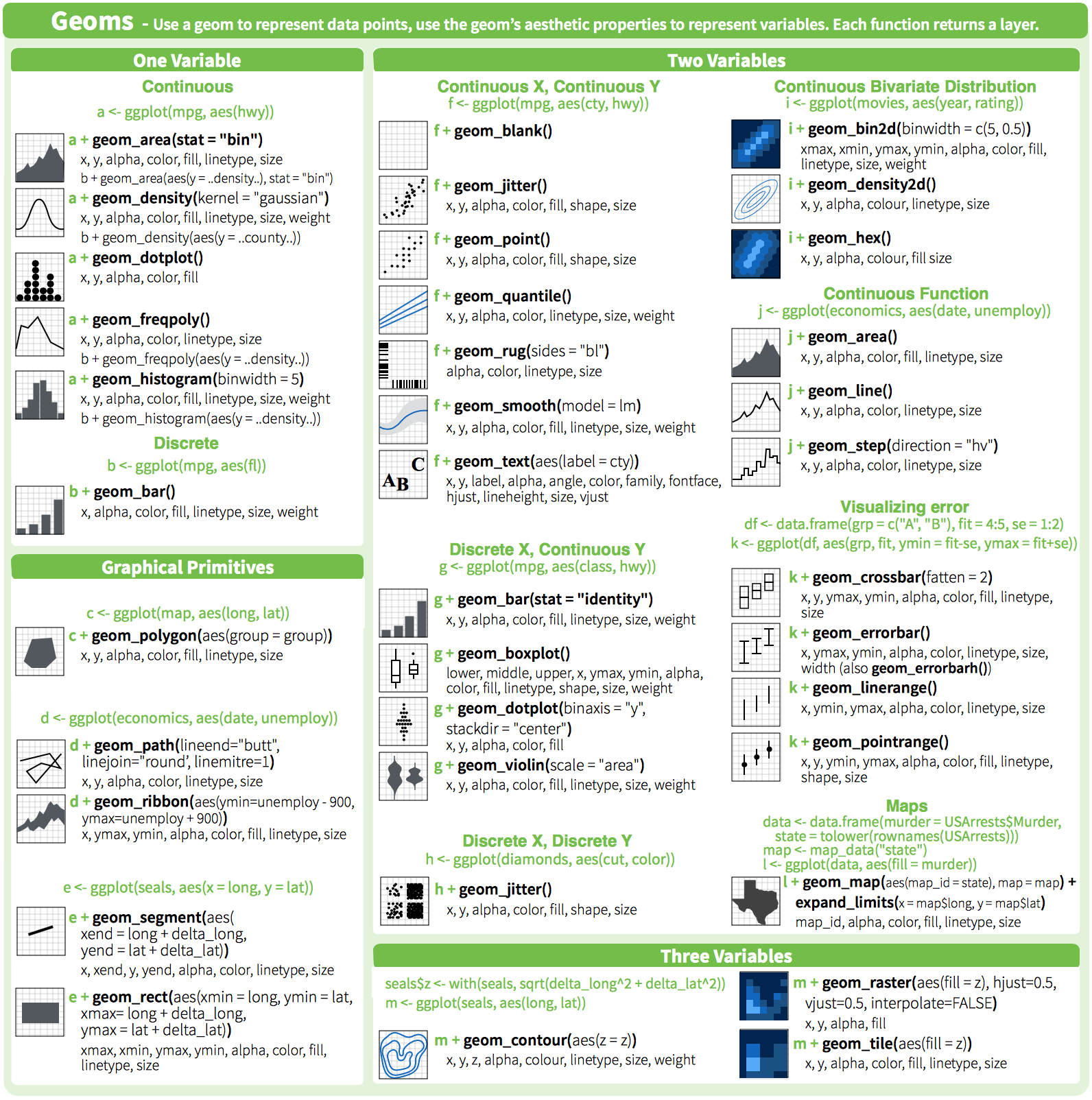] https://www.rstudio.com/resources/cheatsheets --- # Additional resources * `help(package = ggplot2)` * http://ggplot2.tidyverse.org/reference/ * Fundamentals of Data Visualization https://serialmentor.com/dataviz/ .center[] --- # Concluding remarks <br> 1. There are other useful packages that can be used with `ggplot2`! To name a few: `ggbio`, `ggpmisc`, `geomnet`, `gganimate`, `ggnetwork` and `ggtree`. Have a look at [www.ggplot2-exts.org](https://www.ggplot2-exts.org/) for other `ggplot2` extensions. 2. Note that you can learn more about design and image manipulation with the "Introduction to graphic design and image manipulation with open source tools": https://qcbs.ca/wiki/graphics --- class: inverse, center, bottom # Thank you for attending!